ADA signage can feel intimidating, but the basics are straightforward once you know what to look for. Our job is to make sure your interior signage is not only beautiful, but accessible and compliant.
Where ADA Signs Are Typically Required
In most buildings, you’ll see ADA-compliant signs for:
- Permanent rooms and spaces (offices, restrooms, storage, conference rooms)
- Exits and exit routes
- Floor level identifiers and stairs
Not every sign in a building needs to be ADA, but every permanent room must be clearly identified in a compliant way.
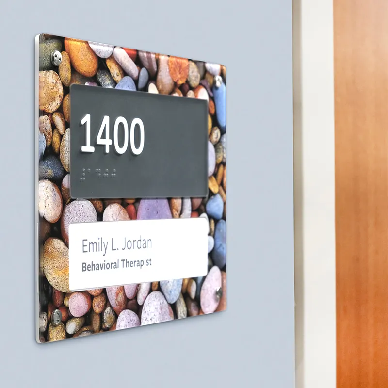
Key Elements of ADA-Compliant Signs
While exact rules vary by jurisdiction, most ADA interior signs share core features:
- Raised text and Braille for tactile reading
- High color contrast between text and background
- Non-glare finishes so signs are easy to read in different lighting
- Correct mounting height and location on the latch side of the door or nearby wall
We bake these standards directly into our drawing sets so you’re not guessing after the fact.
Why Early Planning Matters
The biggest ADA problems usually pop up when signage is an afterthought. If you wait until the end:
- Door hardware may block where signs need to go
- Wall surfaces might not be ideal for mounting
- Rooms may be labeled inconsistently across drawings, schedules, and physical signs
We help plan ADA signage types and locations early, so the building is designed to work with the code, not fight it.
Making Compliance Look Good
“Code compliant” doesn’t mean “ugly.” We design ADA signs to:
- Match overall brand standards
- Align with interior finishes and architecture
- Feel like part of a cohesive wayfinding system
The end goal is simple: everyone can navigate the space confidently, and your project passes inspections without expensive rework.